
When the team at International House reached out to us, they already felt that it was time for a change. It became clear that the logic and transparency of the site needed to be rethought Their collaboration with the previous web development agency had deteriorated, and the website’s design and structure had become outdated.

The goal was straightforward: a website that truly reflects the brand’s quality, is easy to use, and provides a stable, long-term foundation for growth. So we didn’t start the project with design — we started with conversations. During the first workshop, we mapped out how the school works: how frequently the course offering changes, how the marketing team operates, and where the current process tends to get stuck.
We learned that the issue wasn’t that every update required a developer — they were already able to create several types of pages on their own. The real challenge was that tasks which did require a developer had long turnaround times, and the poor collaboration made the process even more difficult. This is what we wanted to change: our goal was to build a system that the school’s team could manage independently, reliably, and without unnecessary reliance on developers.
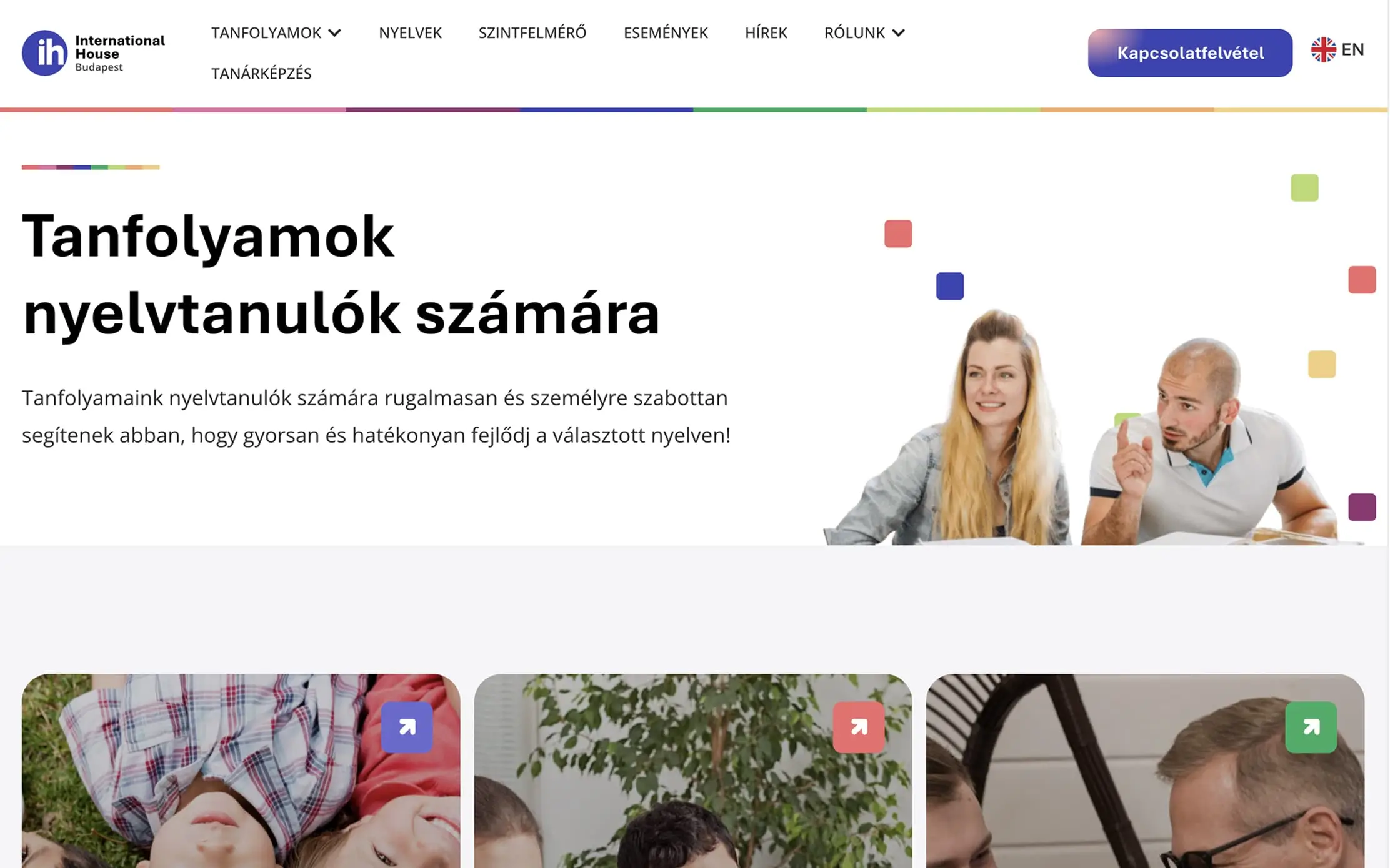
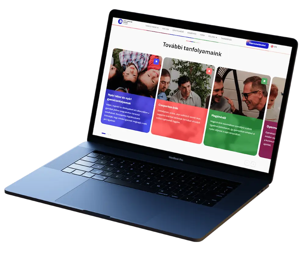
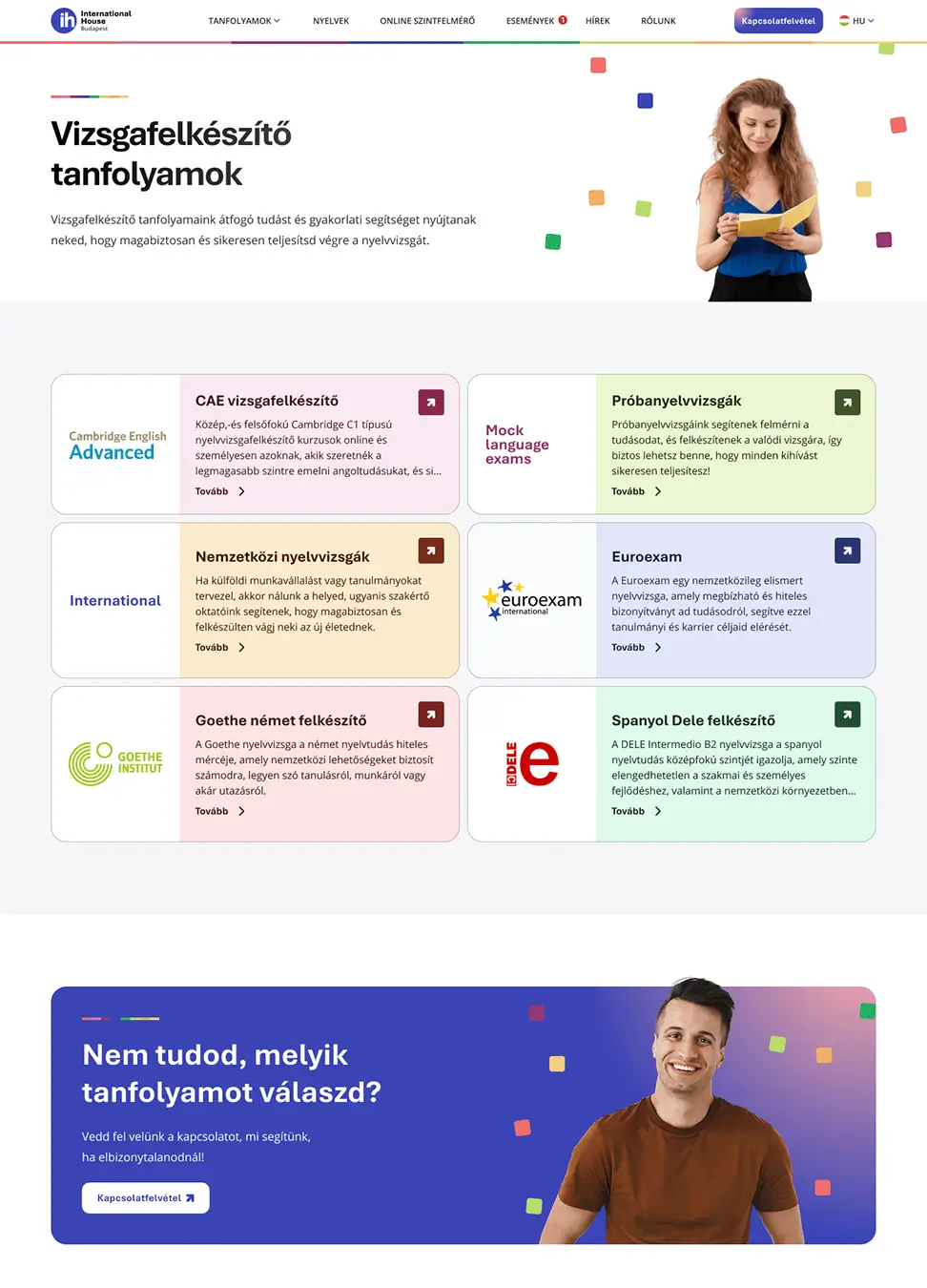
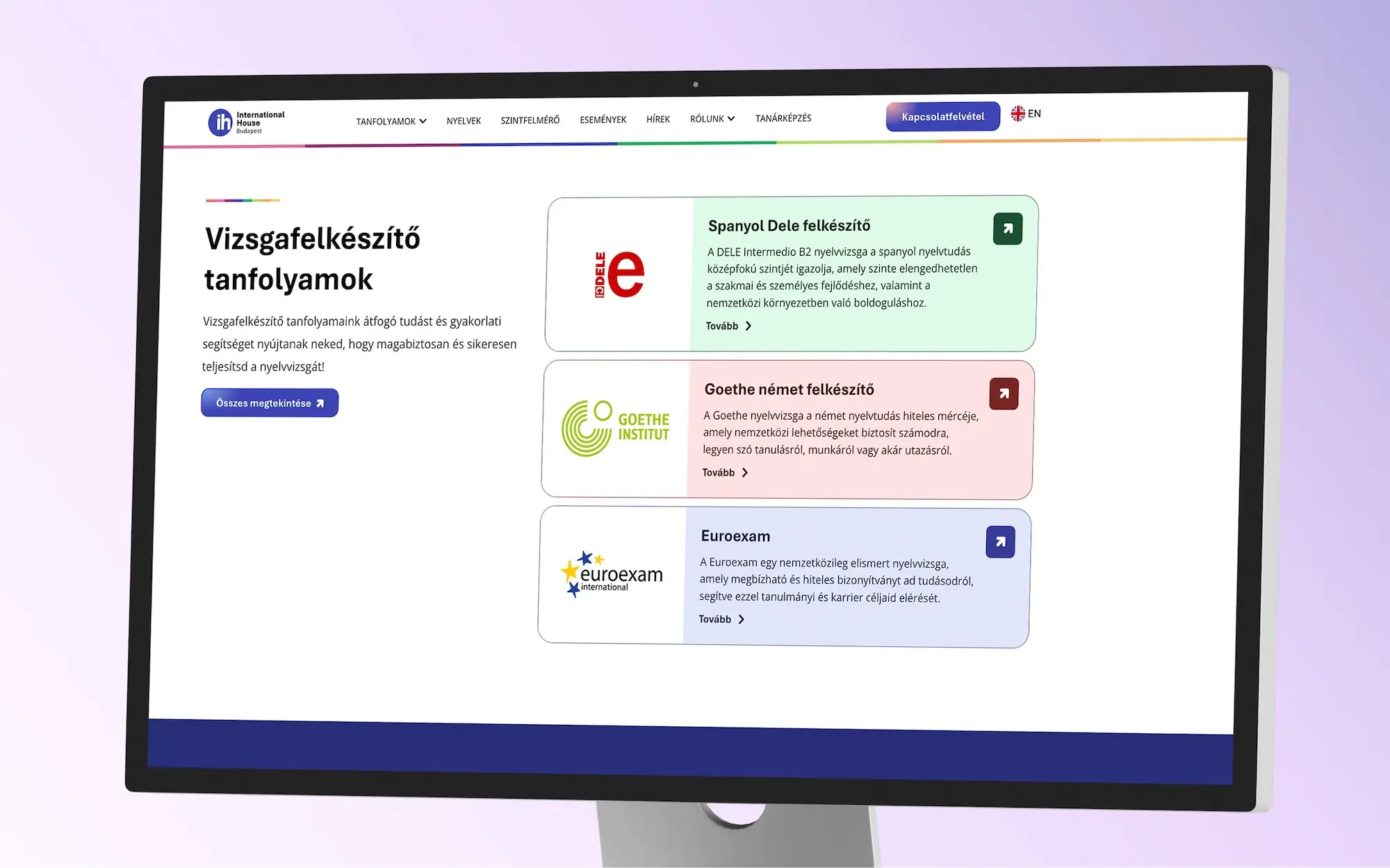
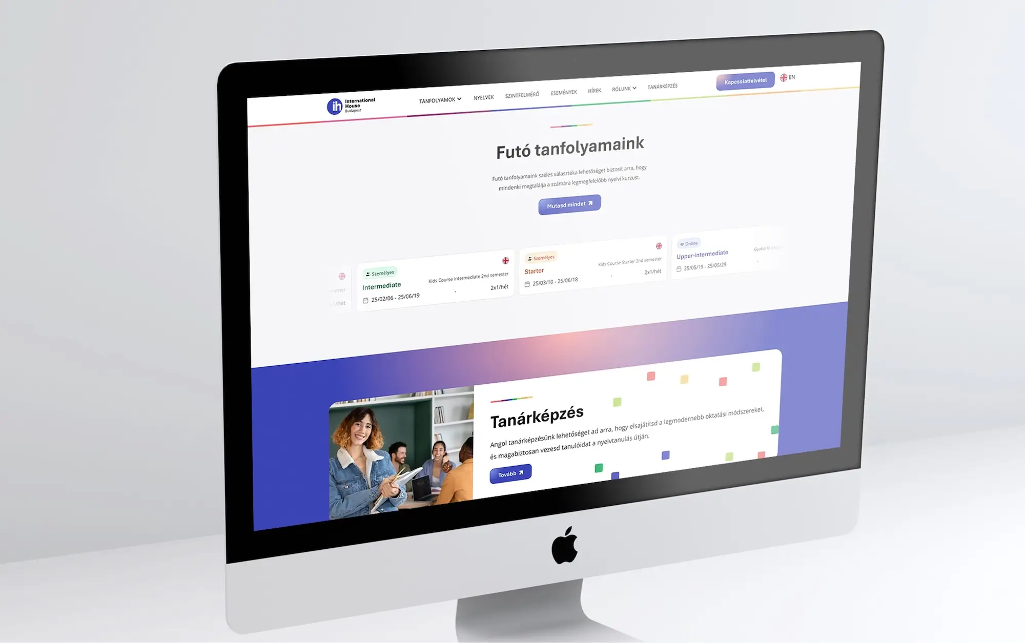
The number of courses and information expanded continuously, so the website needed a logical structure that could scale with it. We built a modular WordPress system where content blocks can be freely combined and reused. This allows the school to create new pages or campaigns on their own — keeping the flexibility they already had, but elevating it with a more modern and intuitive structure.
While shaping the visual direction, we kept the school’s international character, but refreshed it with a cleaner, brighter look. The goal was to ensure the website reflects the same open, modern mindset that International House represents in the classroom.
Although the previous website wasn’t static, the structure that had been built over the years no longer supported the growing number of courses and information. We replaced this with a faster, modular system that can easily be expanded with new courses or features.
We designed the admin interface so updates can be completed in minutes and without technical knowledge. At the end of the project, we held a training session for the whole admin team, giving them complete control over the site’s operation.
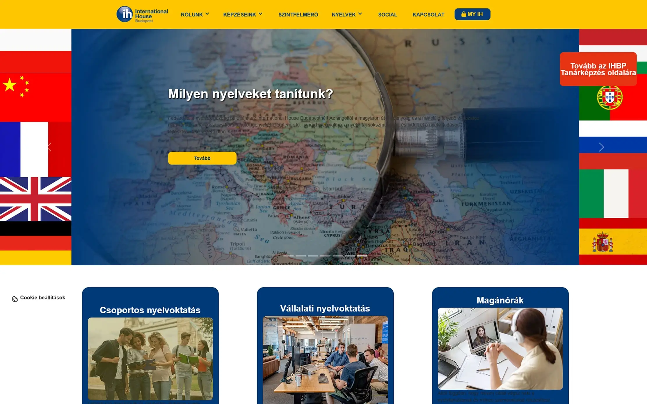
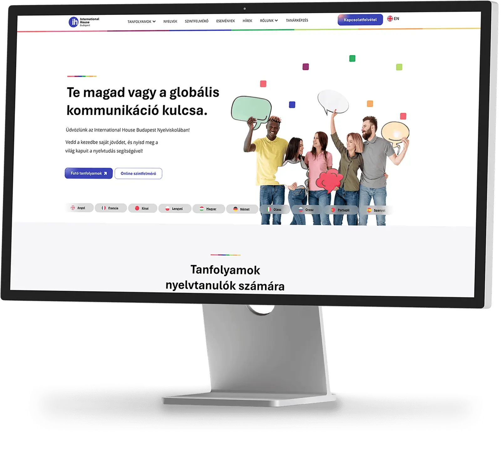
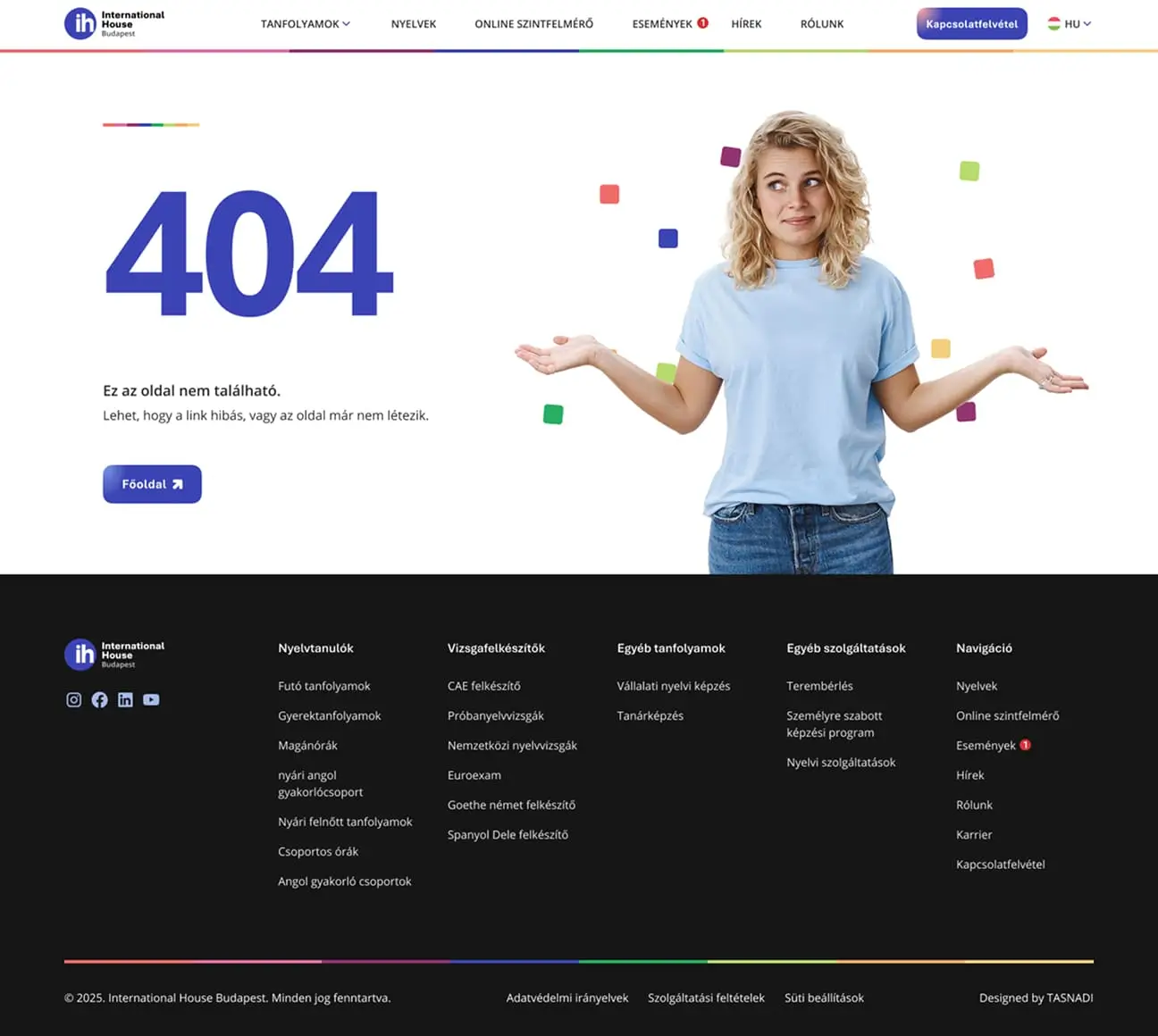
The old website struggled to handle the large amount of courses and information, making it difficult for visitors to find what they needed. Even though some elements could be edited by the admin team, the overall UX was very confusing, resulting in a poor experience for both students and prospective learners. The new version, however, is organised, fast, and consistent — fully supporting the school’s operations and course sales.

Everyone I’ve shown it to says it feels modern, smooth, and easy to read — the end result is outstanding. It’s a really refined piece of work. You should be proud of it, and we certainly are.
David Juhasz
CEO
International House is a global franchise, which means the core brand guidelines were already defined. We respected these foundations and built a visual direction that fits within the global IH identity while still introducing a fresher, more modern look. When comparing the sites of different countries, it’s clear that the framework allows for local expression — and we made the most of that flexibility. The colours and typography reflect a modern, inspiring learning environment while maintaining the school’s friendly, approachable atmosphere. Visitors immediately sense that International House is a professional, open, internationally minded institution.
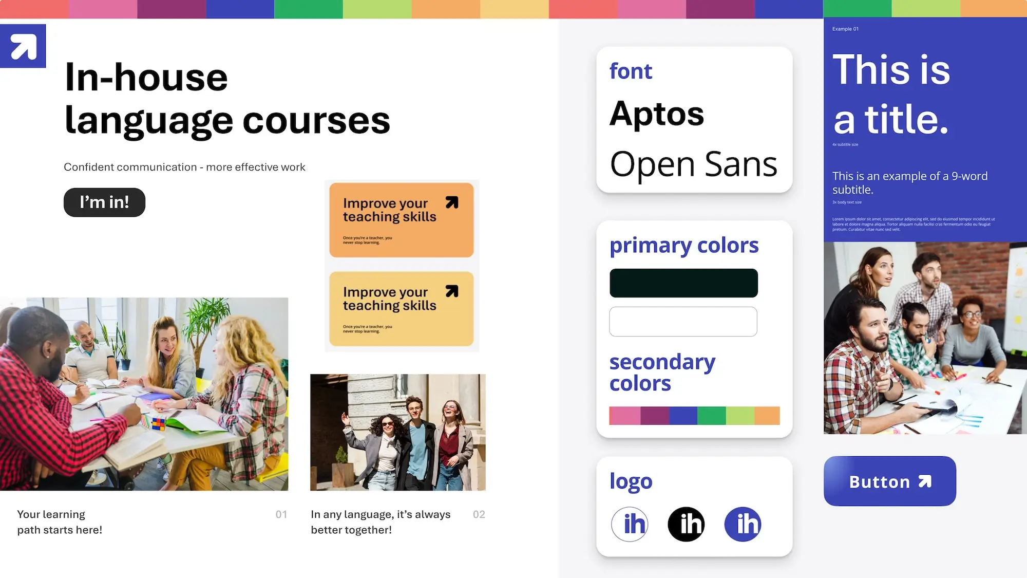
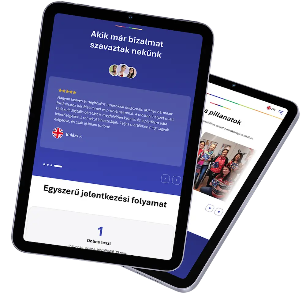
The new visual identity is modern and clean, yet highly functional. Colours and typography aren’t just decorative elements — they support navigation and help structure the course portfolio. The website communicates professionalism and approachability at the same time, just like the school itself.
Our goal was to create a website that delivers the same quality of experience as International House’s teaching methods. Courses are clearly separated, navigation is logical, and every part of the site reflects the high standard that students encounter in the classroom. Learners can find what they need faster, and the marketing team can react more flexibly — resulting in a website that is both beautiful and effective.
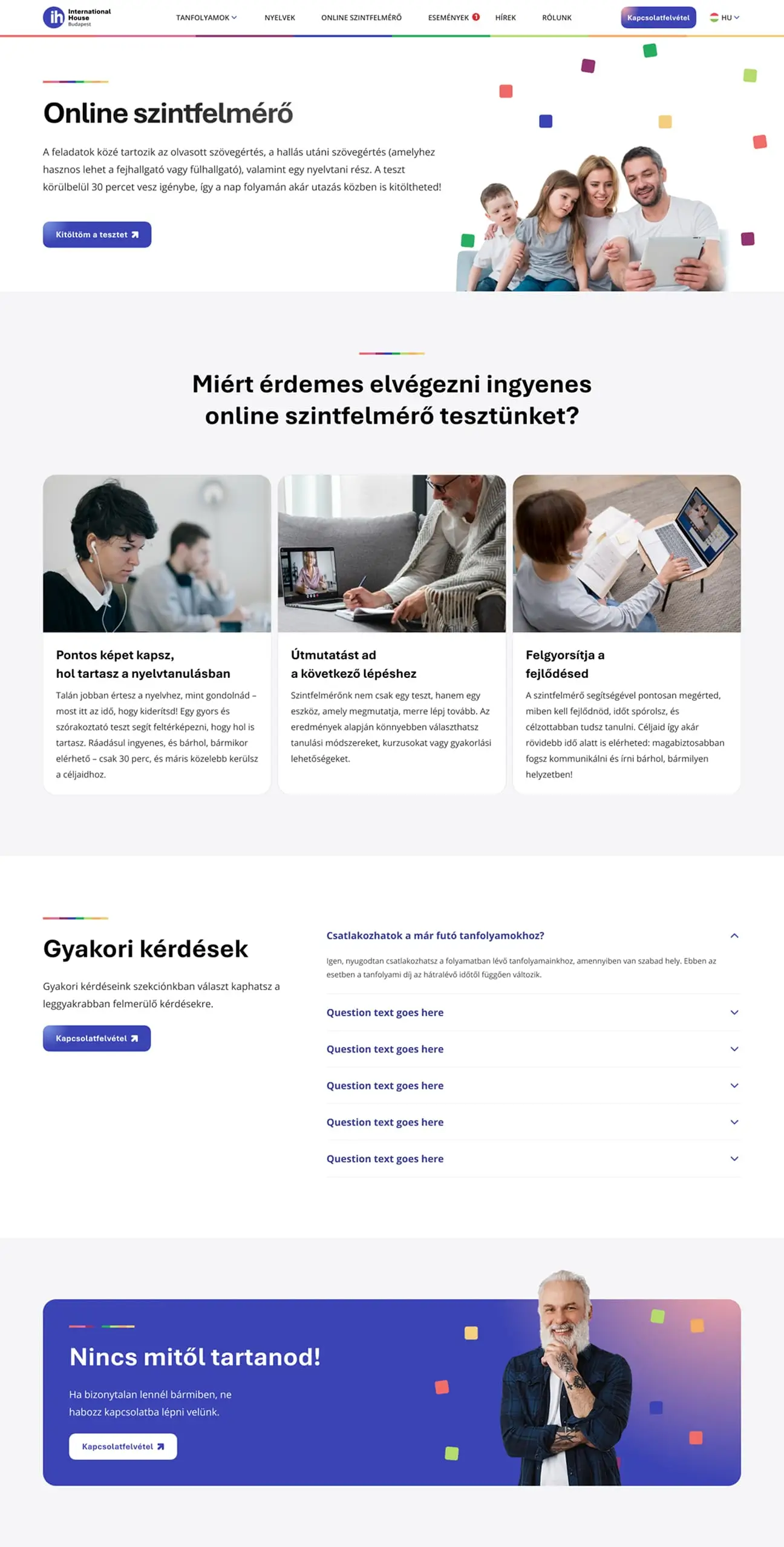
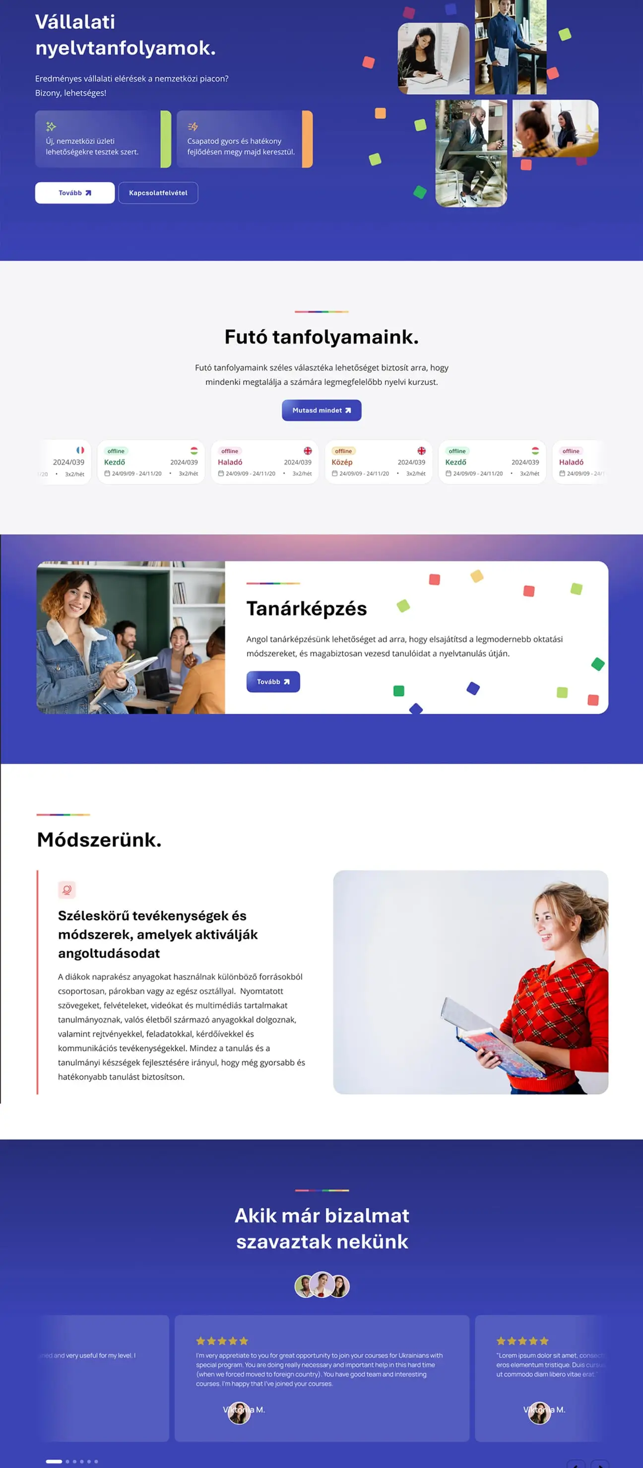
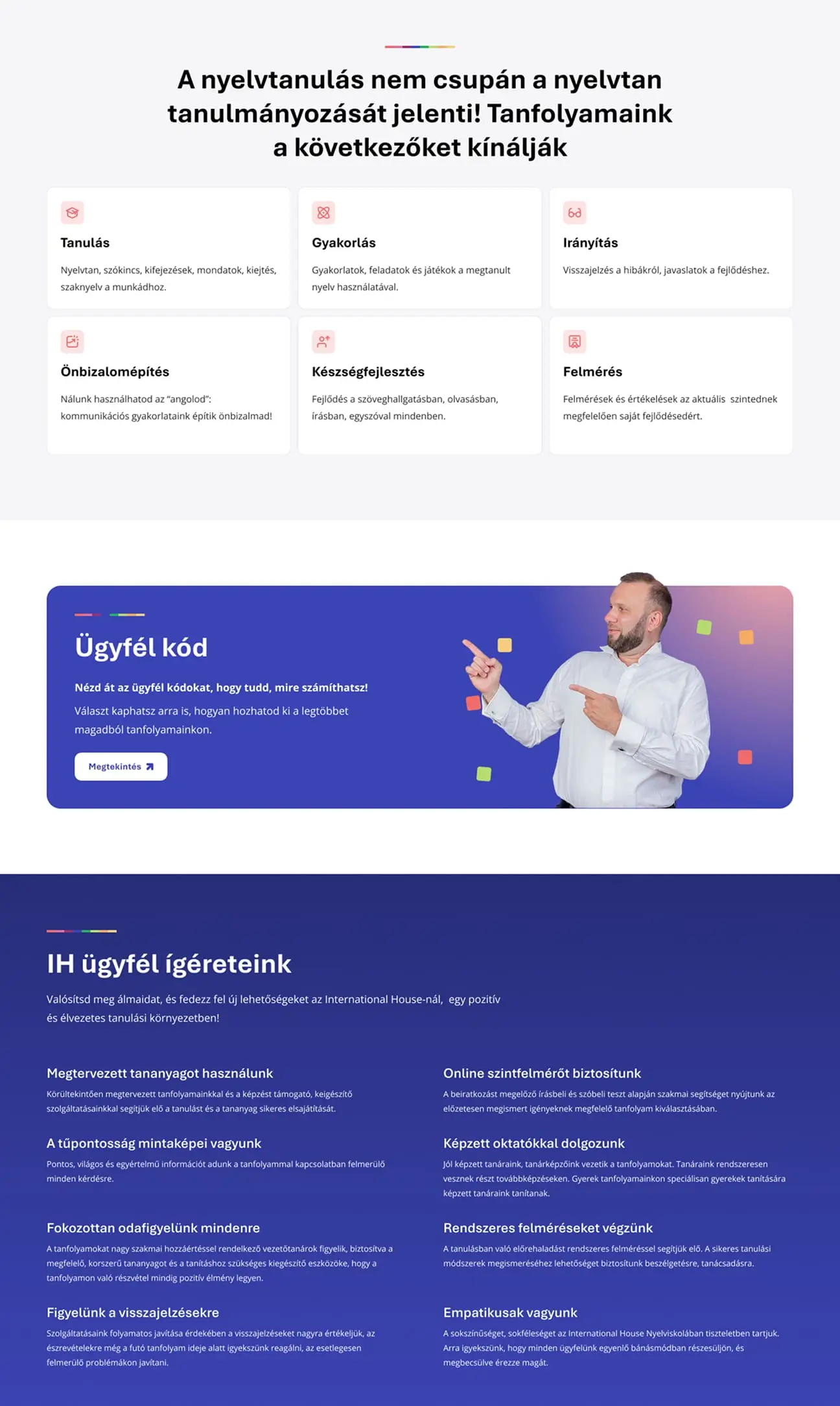
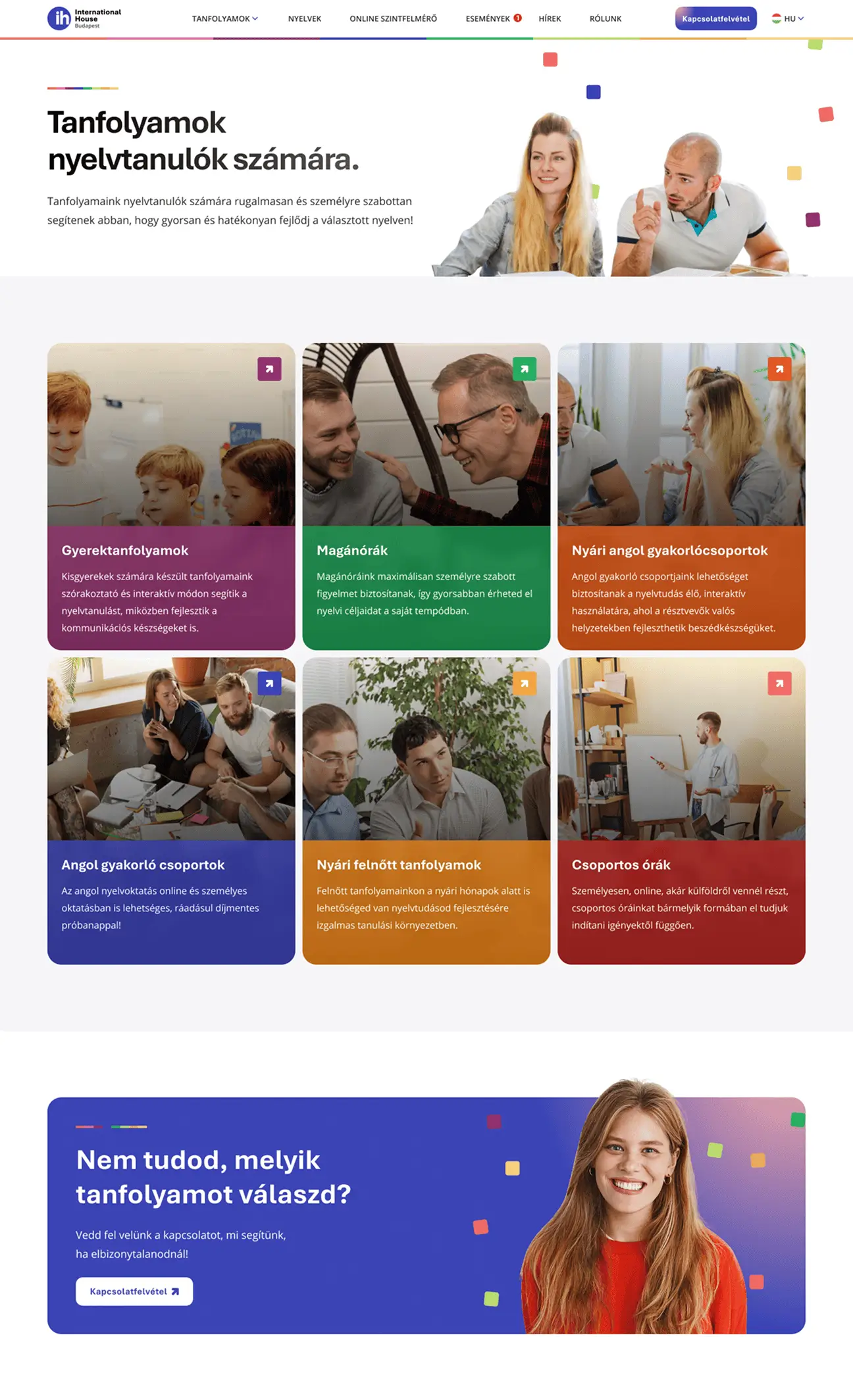
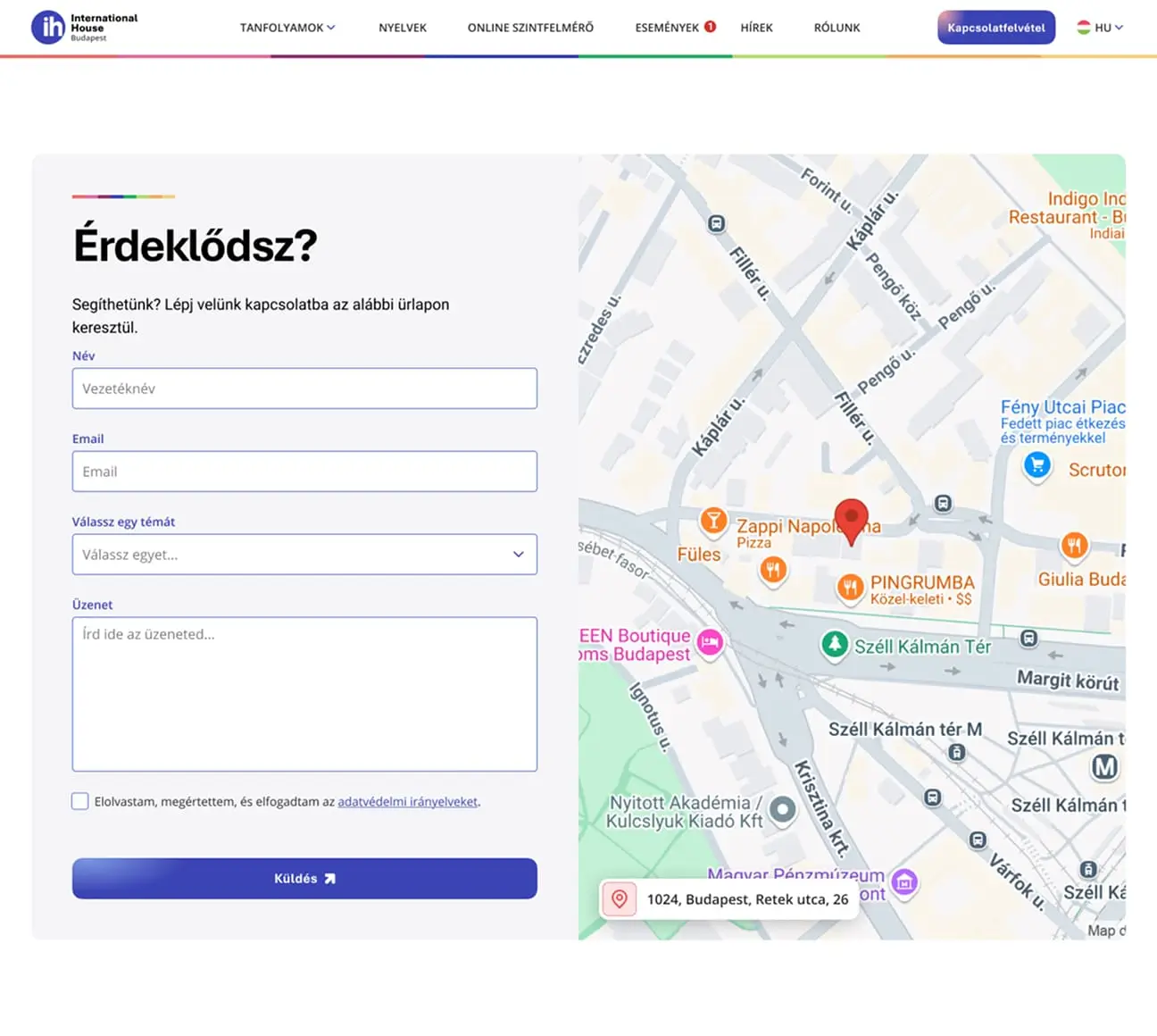
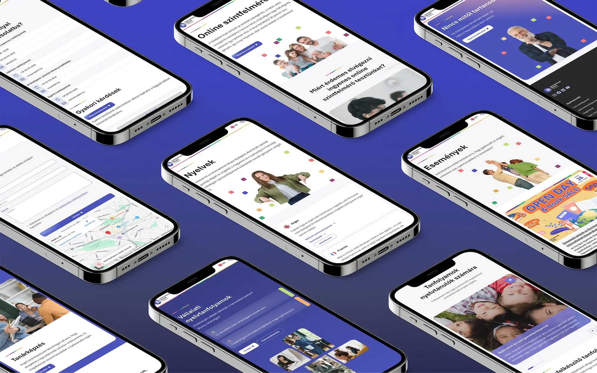
Below we highlighted several key pages to illustrate how the visual system, layout patterns, and interface elements work together throughout the website. These examples show how the design language remains consistent across different sections, creating a cohesive experience for users.

The goal was not just to modernise the website, but to make the school’s everyday operations smoother. The new system is fast, easy to manage, and a highly effective tool for course sales. With this redesign, International House didn’t just receive a new website — they gained a digital platform that reflects the same quality students experience in their classes.
At TASNADI, professional growth, expertise, and attention to detail are core values. We never settle for average — every project is not only about the exceptional end result, but about creating a legendary client experience throughout the process.


Let’s have a conversation and see how we can help boost your brand.
Sounds interesting; let’s chat!

Owner, strategist